Roger Storm
Logo Design

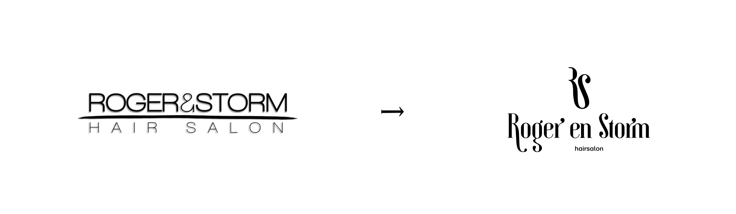
A hair salon needed a new identity. There was no brief - just a conversation and full creative freedom. Before drawing anything, I spent time understanding the business, the atmosphere, the people. Three directions came out of that, each exploring a different character for the same core idea: the letters R and S forming a monogram that nods to the salon's craft.
The logo on the hero image is the final chosen direction. The typography was adjusted by hand - small curves corrected to match the character of the mark. Below are the alternative explorations and the thinking behind them.
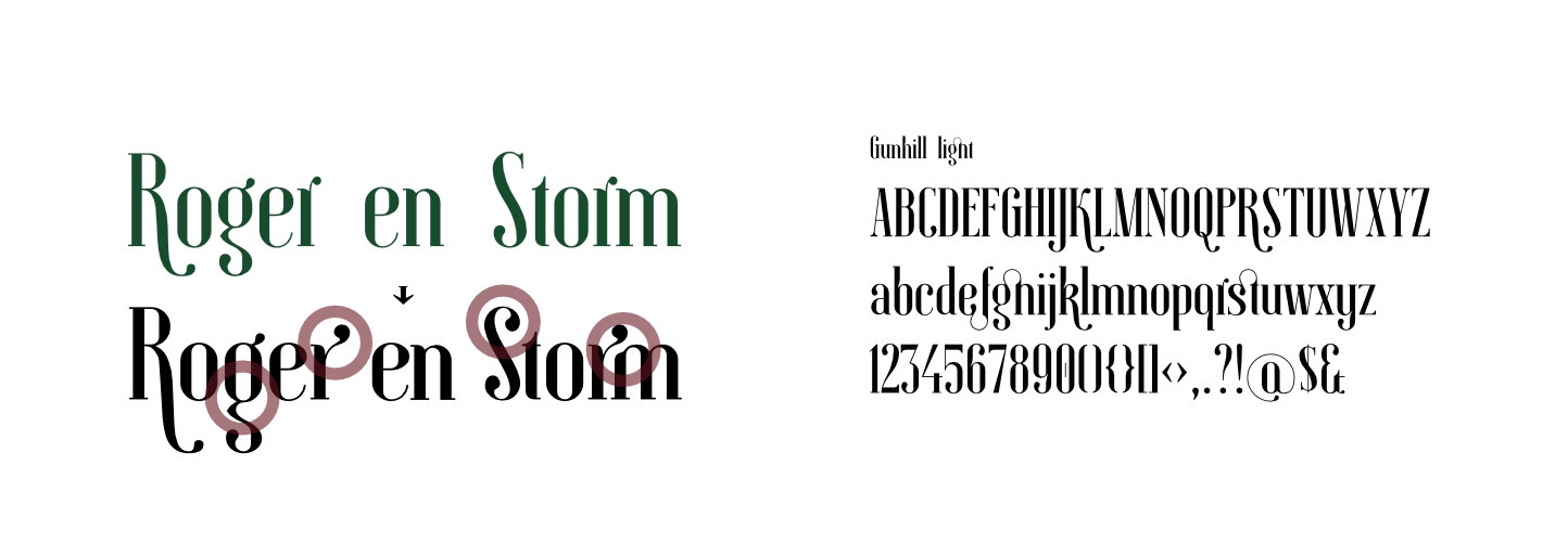
Based on Gunhill Light - but I adjusted several curves so the lettering feels like part of the mark, not just a font slapped underneath.
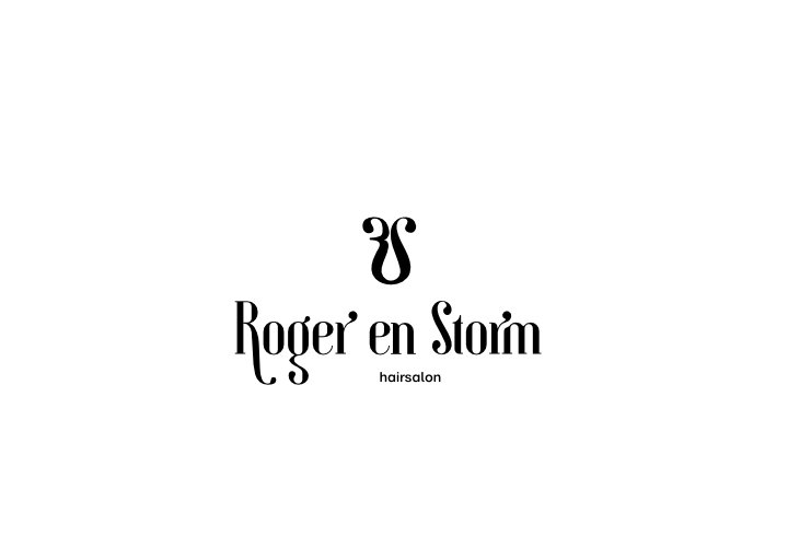
With no brief and full creative freedom, I explored four directions. The hero shows the final choice - the three remaining ones are here. This one is lyrical and flowing, a monogram that feels personal and handcrafted.
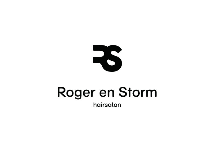
Clean and geometric. Built for confidence at any size - the kind of mark that works on a tiny business card and a big storefront sign.
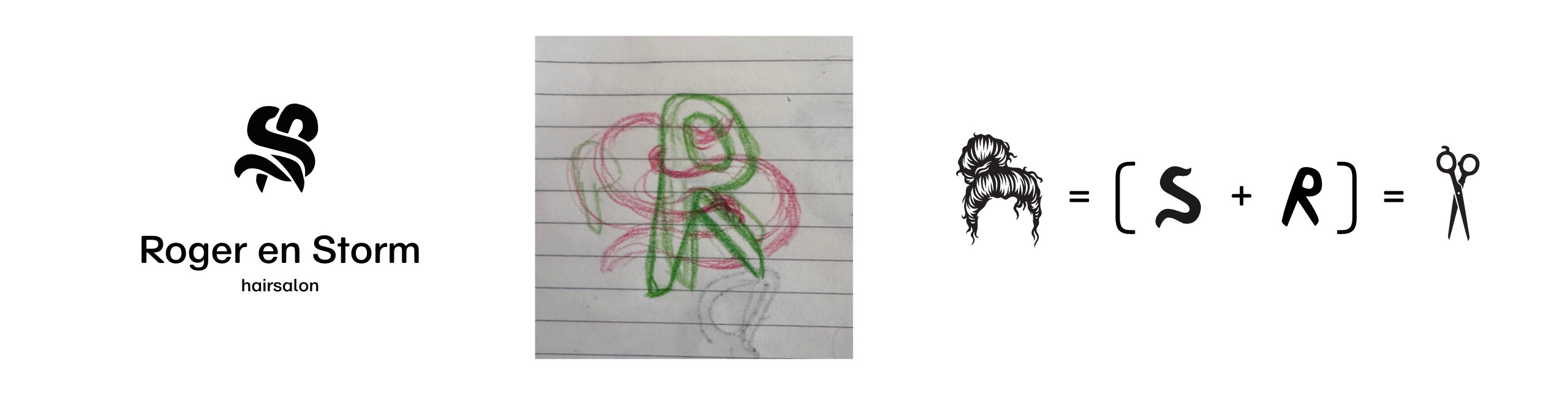
How the chosen mark was built - from a rough sketch to the final construction. The letters S and R woven together, referencing hair and scissors.