Roger en Storm
Logo Design

Client—
Scope
Logo Design
Visual Identity
Typography
TimeApril-June 2026
StatusConcept
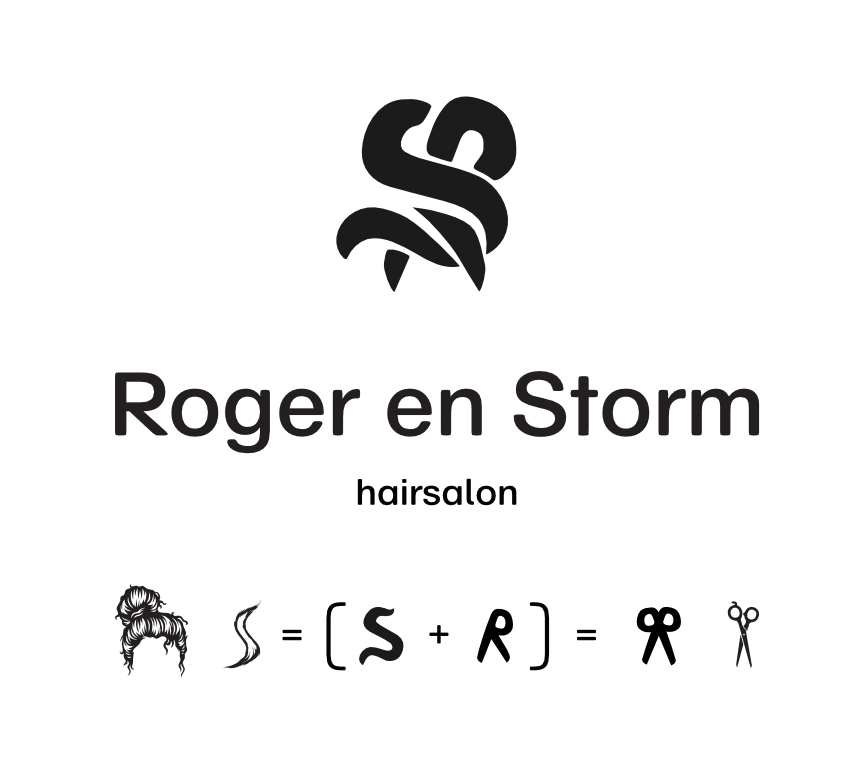
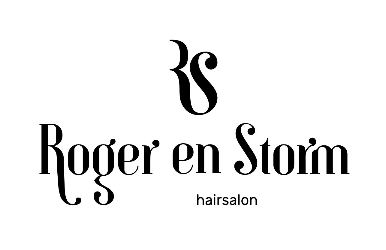
Two friends opened the salon. Their names ended up in its name. The mark joins the owners' initials into one shape: a falling lock of hair, and a knot - two people working as one.
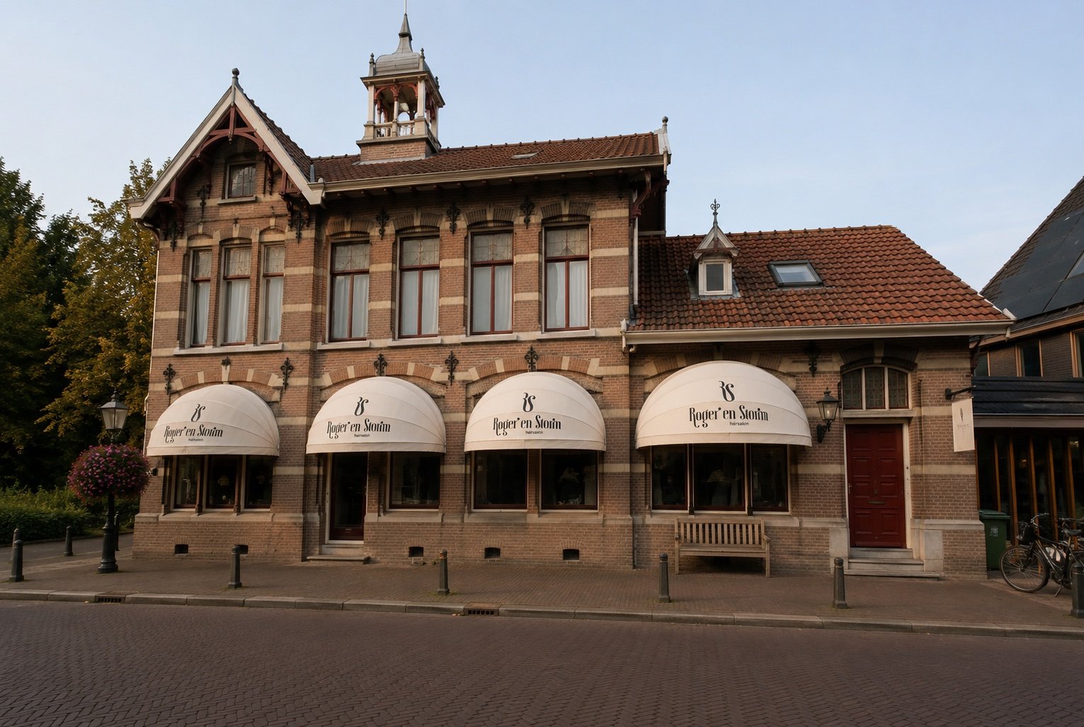
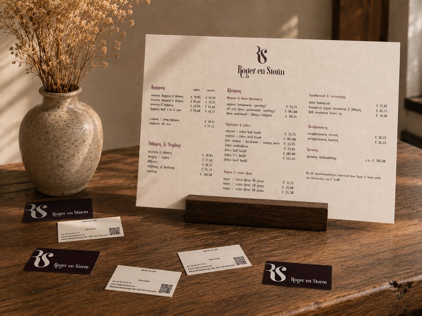
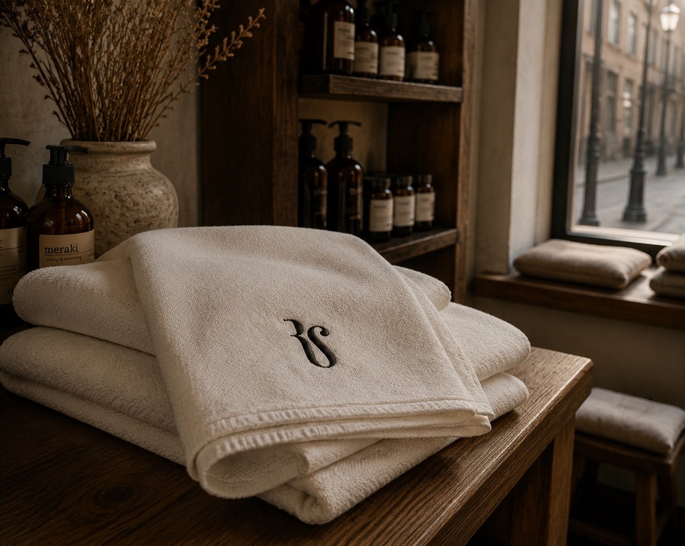
This rebrand is a self-initiated concept and it was never implemented. The application shots are visualisations with my own files composited onto them. They are not documentation - the project was never rolled out.
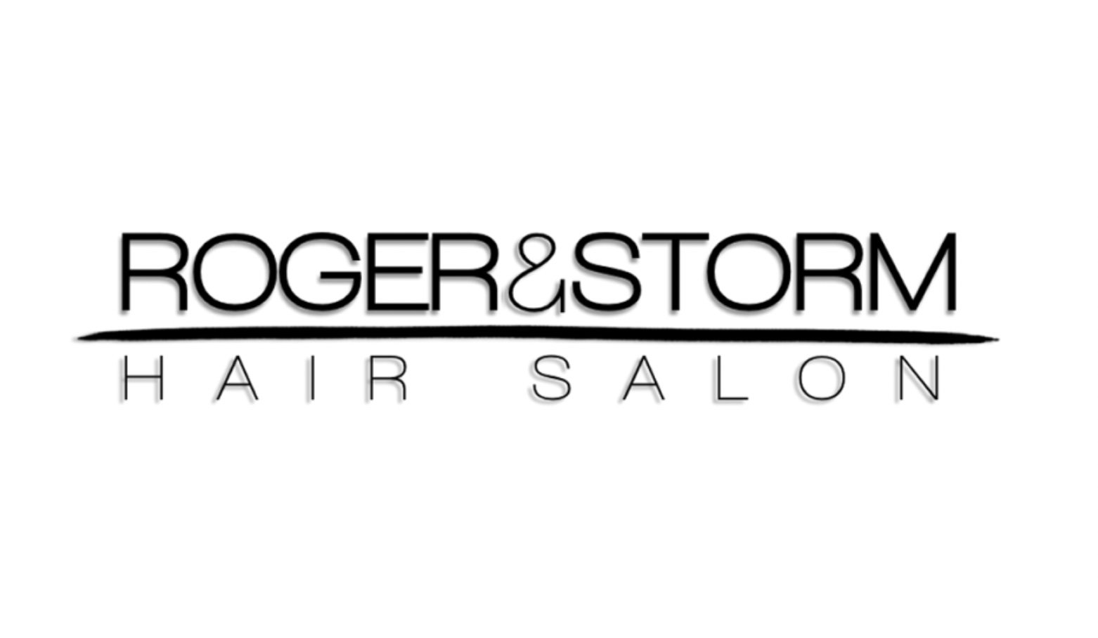
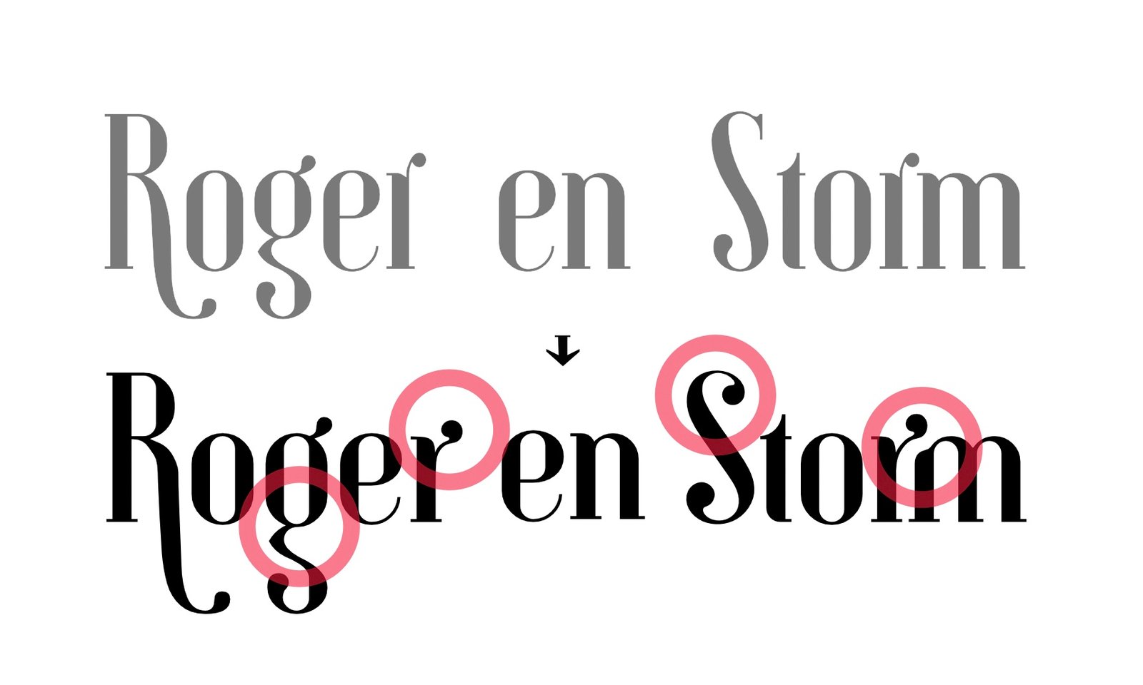
before
after
The logotype is built on Gunhill, though it needed a few changes. The places that were corrected are marked in red. The monogram was drawn from the capitals.
the search for a form
Looking for the form turned up three more directions for the mark.