Pachamama
shop redesign

Pachamama is an Amazonian tea brand - guayusa, which the Kichwa tribes have been brewing for a few hundred years. A small, snug, homely little shop, standing on an enormous, overloaded template.
Their samples reached me by accident, I liked the packaging and went to look at the site out of curiosity. I decided to take the initiative and design a site as snug and as curious as the packs it would flow from.
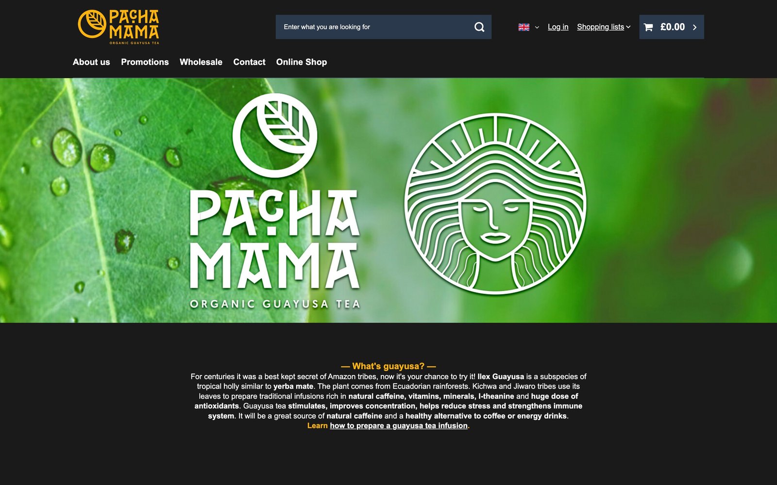
The problem was not a lack of visual consistency. It was that nobody had chosen which platform features were needed - the shop runs all of them at once. Comparison tools, shopping lists, instalment banners, trust badges, lowest-price history. On every page, over a catalogue of barely fifty teas.
01 - navigation
Navigation that breaks the convention.
Pachamama competes with hundreds of shops that look alike, because they stand on similar templates. For fifty teas from one small brand, being remembered is the only thing separating a return visit from an accident. I bet on the unconventional, so the site would be the thing you remember.
I took the top bar off and ran the navigation vertically through the middle of the screen: icons at the top, the mark in the centre, the name set vertically underneath. It is the one element that looks the same on every page - if anything is going to stick, it is that.
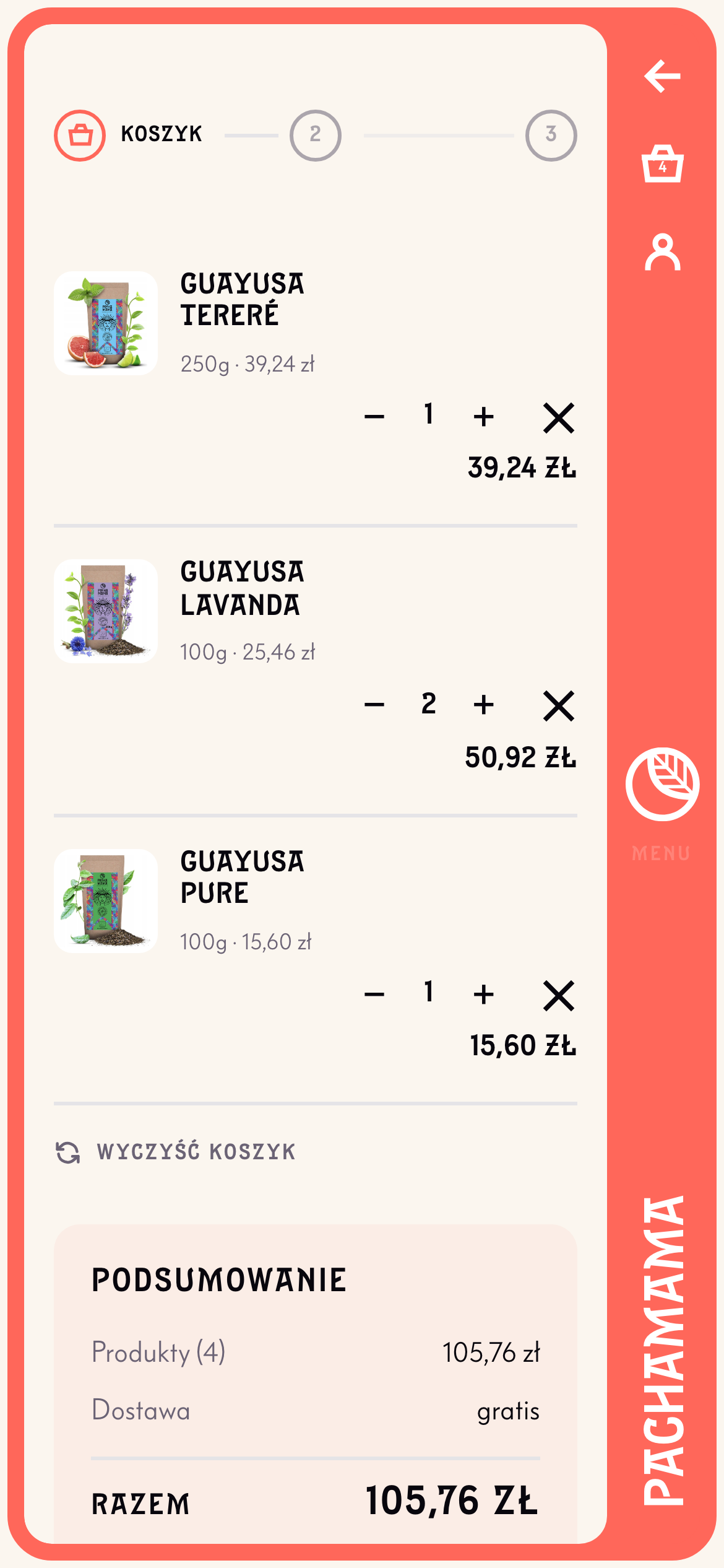
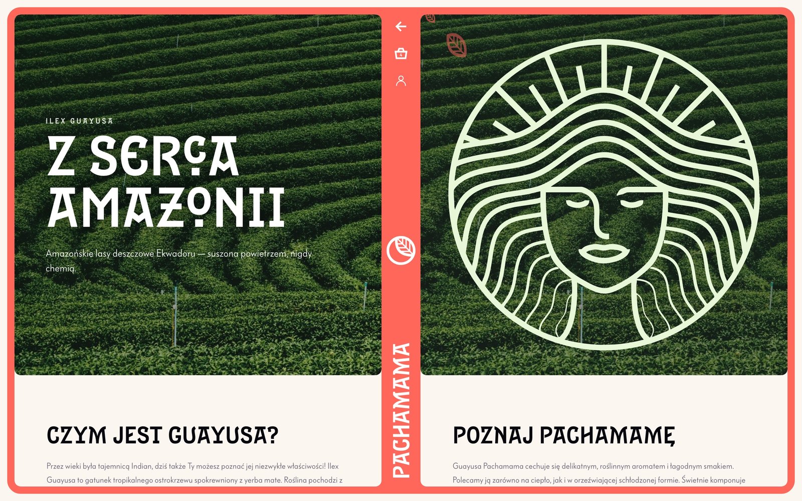
The layout of the navigation was dictated by the shape of the logo. A circle - radiating during the transitions - with a leaf at its centre is a sun: it stands in the middle and everything turns around it. It looks a little like a book spread, but the left side is no different in kind from the right; this is not a division of the page, it is the axis I arranged it around.
02 - the menu
The goddess moved into the menu.
The mark is the menu button, not a link to the home page. Deliberately: it is the most prominent point in the whole interface, and spending it on something people use once a visit is a waste. The way home goes to the wordmark - the brand name standing under the mark - so nothing is lost.
She is on every pack, her loose hair in waves, a wreath of rays beating out from her. On the old site she stood halfway down the home page as a motionless yellow medallion, doing nothing.
Here, in the menu, she is alive and her hair sways. She reacts to you: as you click or move across the menu items, the goddess opens her eyes and her mouth. This is not a pasted-in illustration - it is close to four thousand paths, and they genuinely move.
The same wreath that beats out from her carries us between pages: the rays fly out of the leaf and the page changes. The mark, the menu and the transitions are one system, not three ideas standing next to each other.
03 - the catalogue
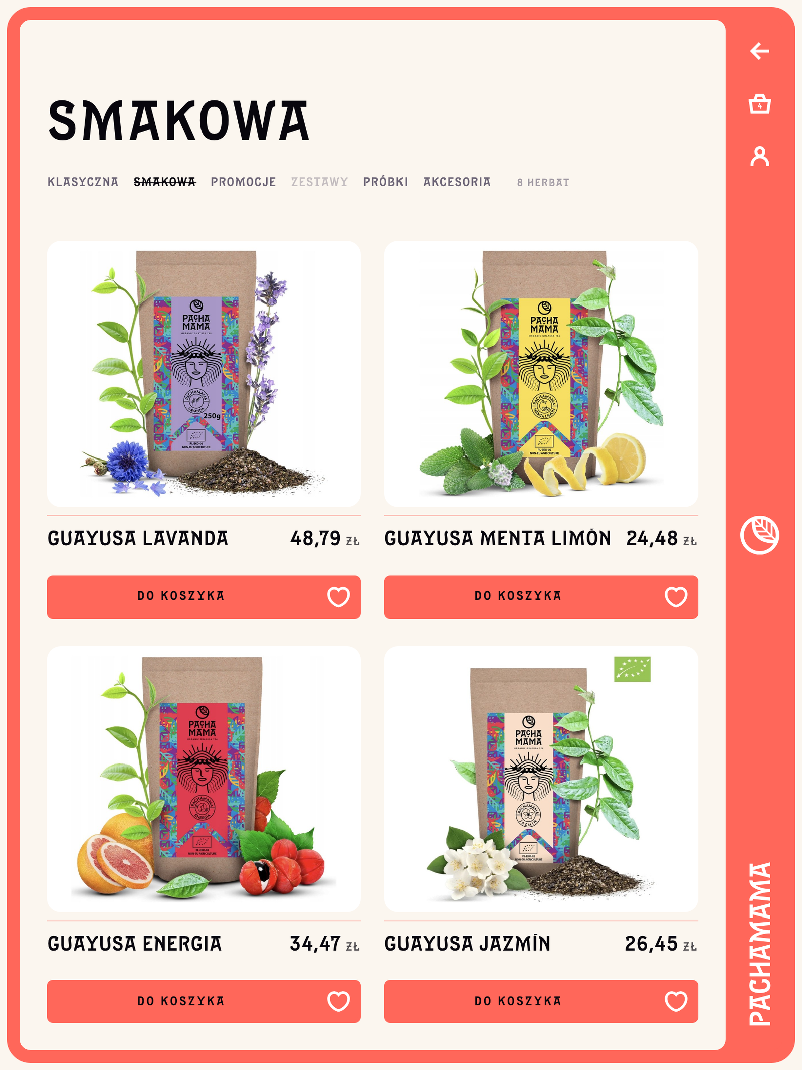
Less is more.
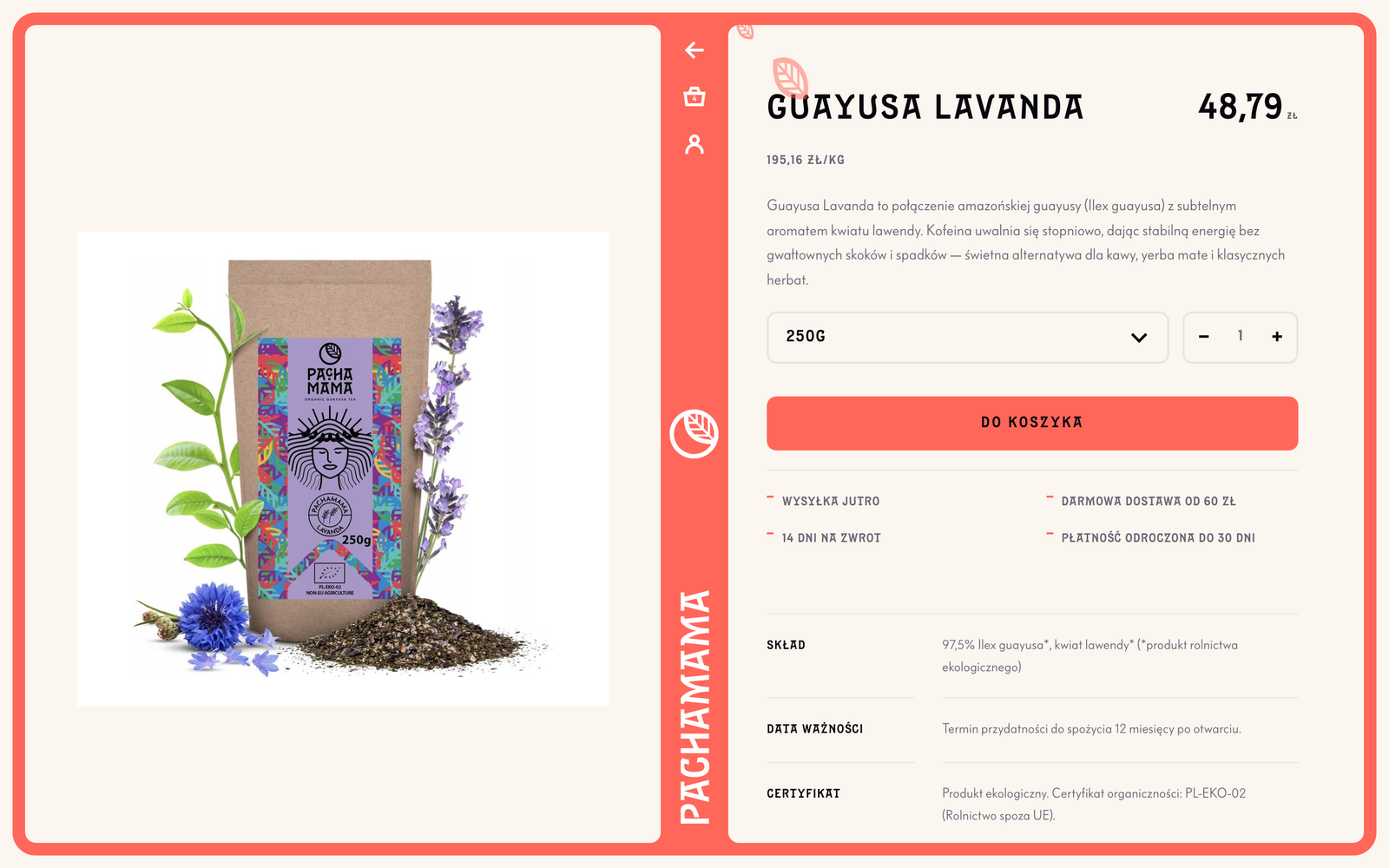
What is left is the photo of the pack, the name, the price and a button. The price history moved to the product page - that is where the law wants it and where somebody is actually deciding. The filters sit along the top and say how much of what there is: nine teas.
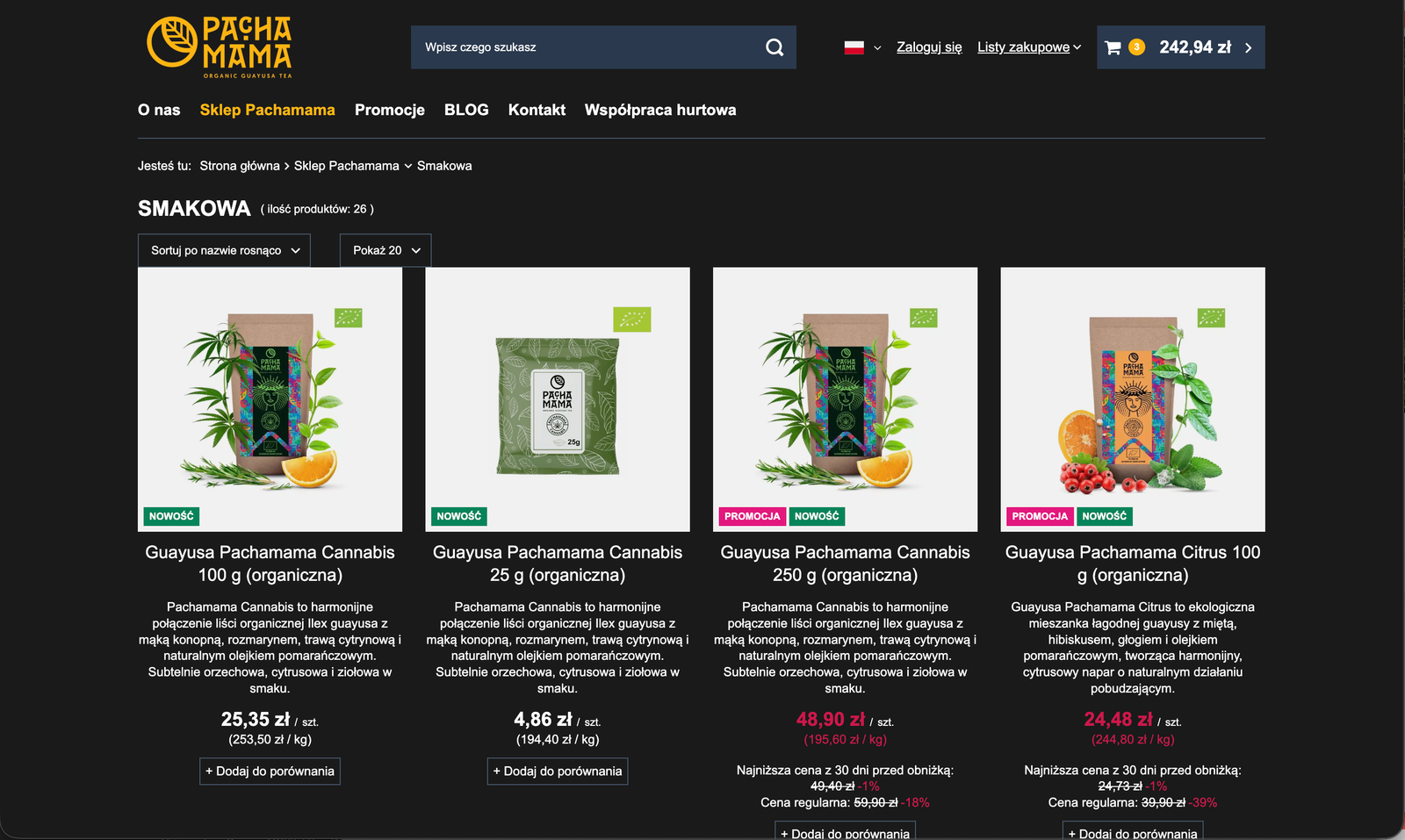
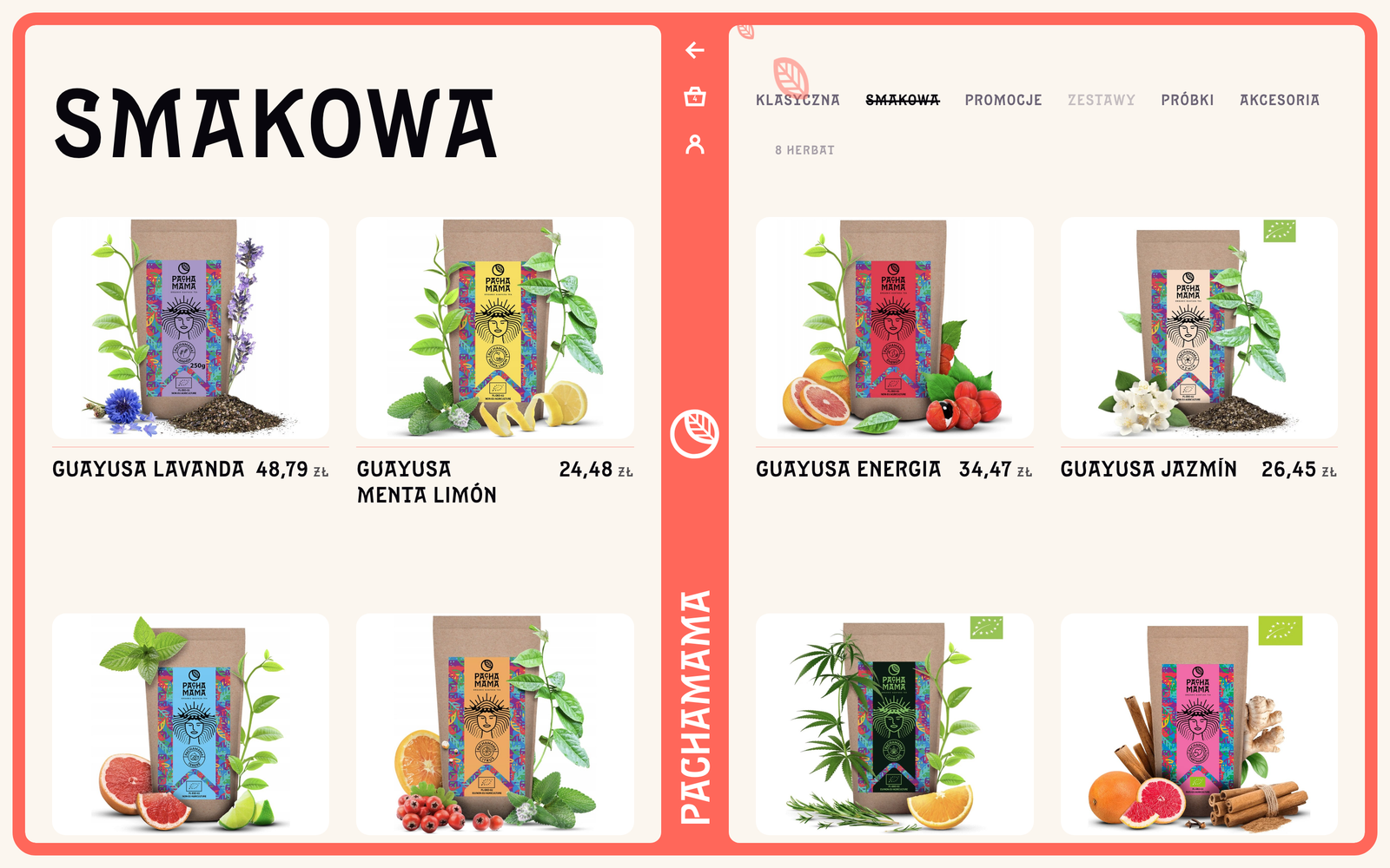
The original product list stacked a mass of extras under every tea: a paragraph of copy, a compare checkbox, a unit price, a price per kilo, a struck-through price, a discount percentage and the lowest price of the last thirty days. Nine things answering one question: do I want this tea. Decision paralysis, guaranteed.
04 - the checkout
A shorter road to the finish.
The fourth step was called "verify your details" and showed you what you had just typed. It went. The summary now stands beside the form the whole way and changes density: the full list with quantities in the cart, a strip of photographs at the details step, figures only at payment.
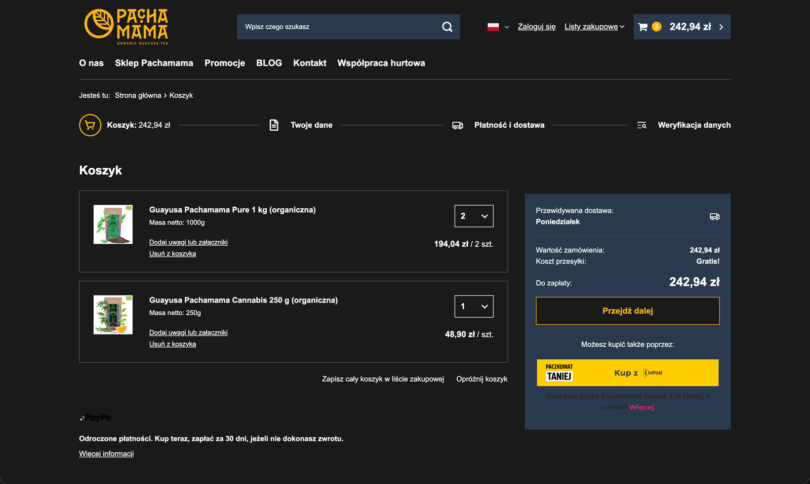
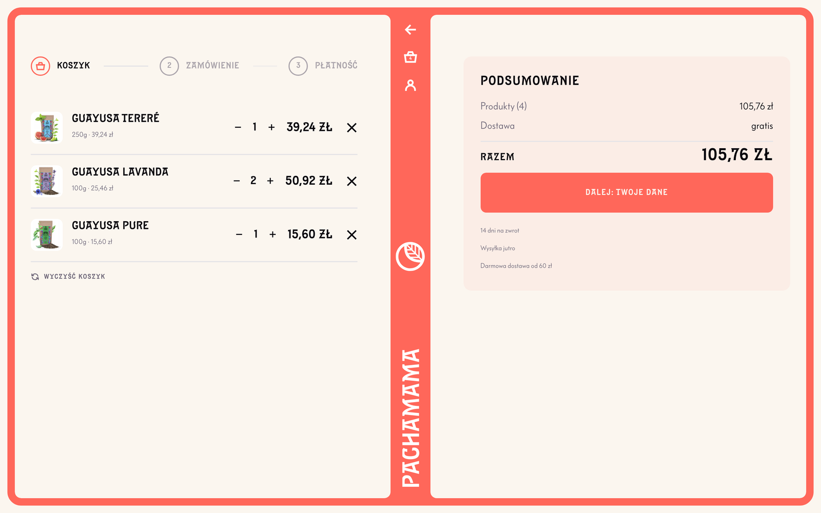
Five things stood around the order competing with it for attention: a delivery estimate, save-to-list, empty-the-basket and two payment banners. And a gate in front of all of it - sign in, or buy as a guest.
Delivery moved from payment up to the address. It is the one choice that changes both the total and which fields make sense - a parcel locker does not need a street. Three options stand side by side with a price and a date: a courier tomorrow for 14.99, a locker in two days for 11.99, collection in Wrocław for nothing.
The sign-in gate went with nothing in its place. You get an account from a checkbox on the way through: "create my account from these details, a password is enough". Choosing "company" reveals the tax number that nine people in ten will never see.
Three steps are left instead of four, and every function survived.